Sheet 008 — 2026
Building Eskiz, chapter two: a dashboard you can talk to
Eskiz puts one thing in the middle of the dashboard and one bar at the bottom. Here’s what we left on screen, what you can ask for, and what it took to make “next section” feel like a button.
01 / 10
I came here to open a project.
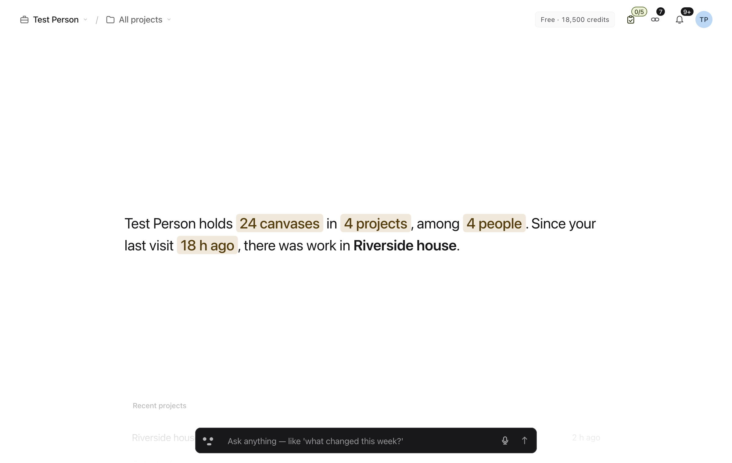
You open Eskiz to get back to Riverside house. Someone may have changed a drawing since yesterday. You want to know what moved and get on with the work. A dashboard can make this simple, or it can give you eleven small rectangles and a second job.
Mobbin looked at 2,108 dashboard screens across 536 apps. The examples we kept coming back to put a useful interpretation or next step beside the data. We looked through shipped products in its library and used the examples from its YouTube channel to compare what teams put first and what they leave for later. Mobbin’s dashboard study
In Eskiz, the Brief gets the centre. It tells you what changed since your last visit and gives you somewhere to go. Scroll, swipe, or use ↑ and ↓ and the next section takes over. Its neighbours recede. If your finger is over a long list that can still scroll, the list gets the gesture first. The section can wait.
02 / 10
The bar at the bottom does most of the work.
The blank space is only useful if the next thing is easy to reach. Press ⌘K, or Ctrl+K, and the Omnibar works like a command menu. Search for a project, choose a command, or browse suggestions for the page you’re on. Type > to narrow the list to commands.
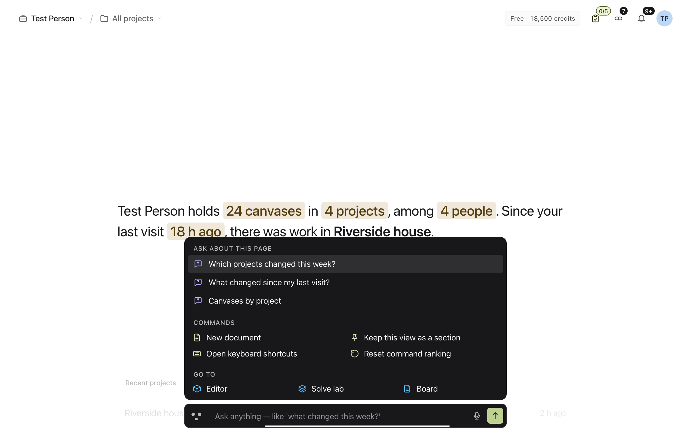
You can also type or say “next section,” “previous section,” or “open Riverside house.” The page moves and you carry on. “Start a new canvas” opens the form for review. “Which projects changed this week?” brings an answer onto the page, where you can open it as a view, keep it as a section, or dismiss it.
That’s what we mean by AI-first here. The assistant works on the page you already have open, using the same actions as the visible controls. A one-line request should leave you looking at your work, with as little ceremony as a keyboard shortcut.
03 / 10
Give the answer a place to live.
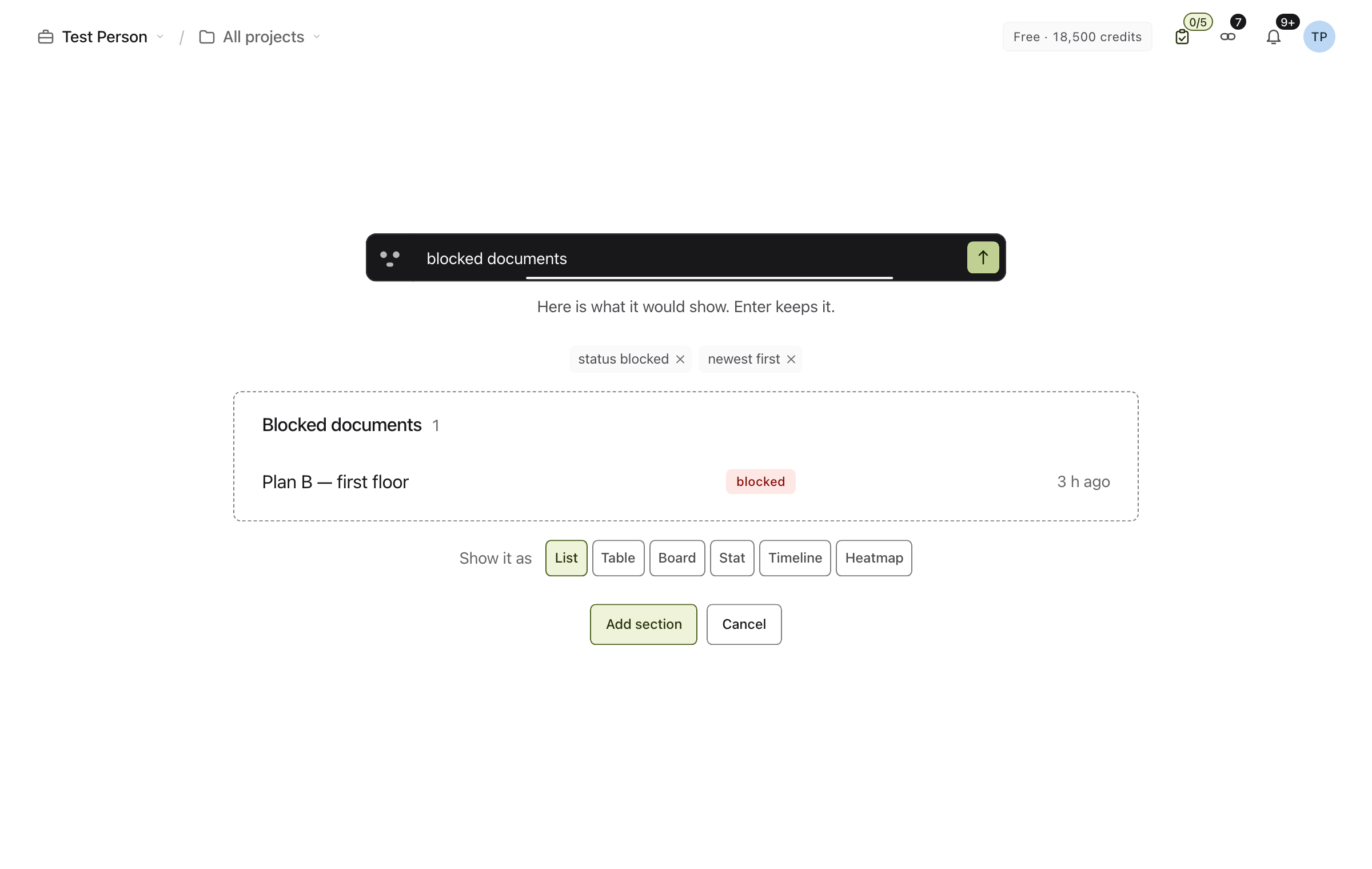
Suppose the question you ask every morning is “Which drawings are blocked?” At the end of the stage, choose Add a section and describe what it should show, or start from a suggestion. The composer previews the result before you add it. Pick a format, edit the filters, rename the section, and move it up if it belongs closer to the Brief.
04 / 10
The plain project list is doing its job.
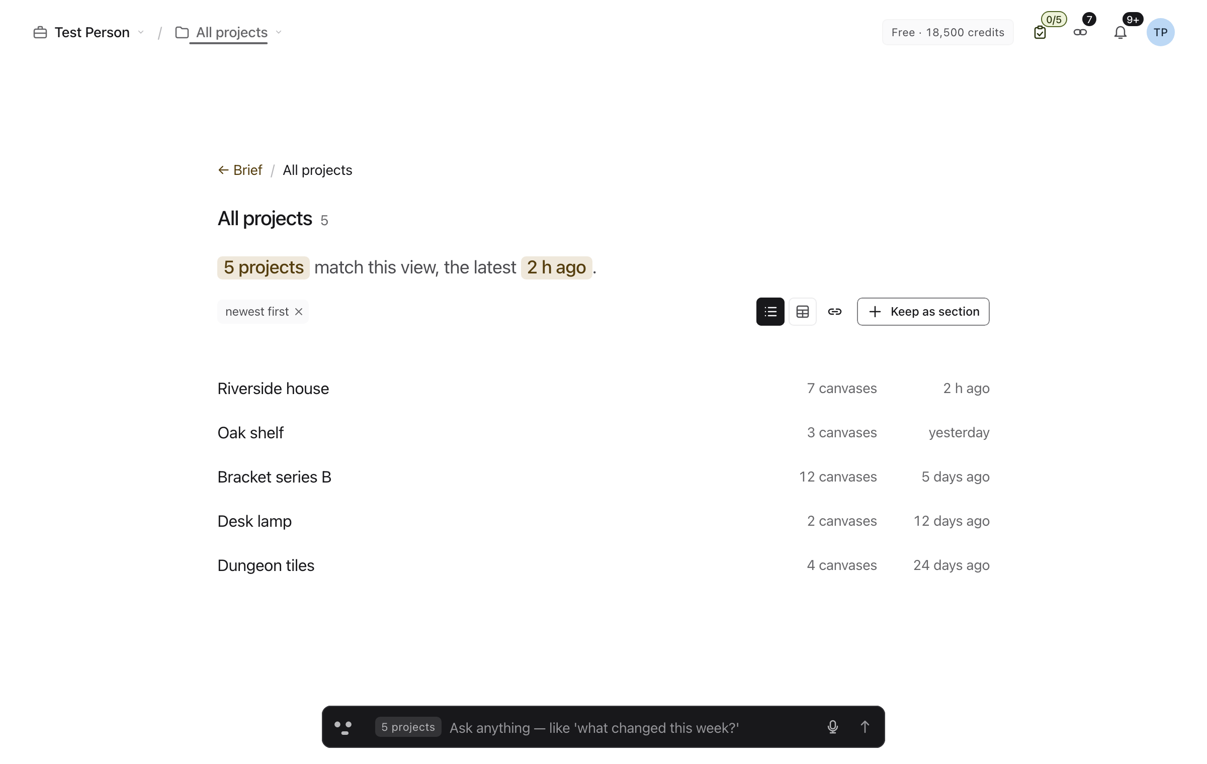
The same idea applies to All projects. Open the focused view from the project menu in the header. Its layout and filters are visible and editable. “Show this as a table” and “sort by name” are ways to change the same view. The filters are still there to click. You can see the state you’re in and change it again tomorrow without reconstructing the conversation.
05 / 10
The microphone needs manners.
Hold Space outside a text field to speak, then release to send. Space still types a space when you’re writing. The microphone button also lets you start a hands-free turn that listens until you pause. That pause is an actual design decision. Stop too soon and you lose the project name. Wait too long and the user says it twice.
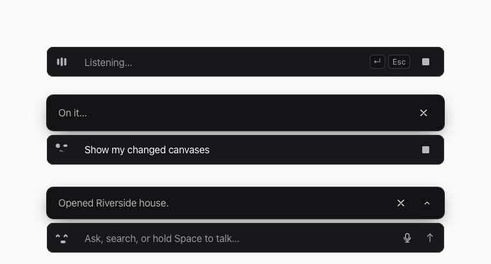
The little Companion changes with the turn. The meter shows when you’re being heard, the bar shows what it heard, and captions let you follow the response with the sound off. You can interrupt speech or turn spoken replies off. For a longer exchange, dock the conversation to either side and keep the work visible. Move it back to the bottom when you’re done. Learn can take over the frame briefly to bring a control into focus.
06 / 10
“Do it” and “show me how” are different requests.
“Create a project” opens the form. “How do I create a project?” enters Learn. The Companion walks you to the real control, highlights it and can speak the next step. The guide waits while you do it. The avatar menu has Take the tour again for the broader voice-guided walk-through.
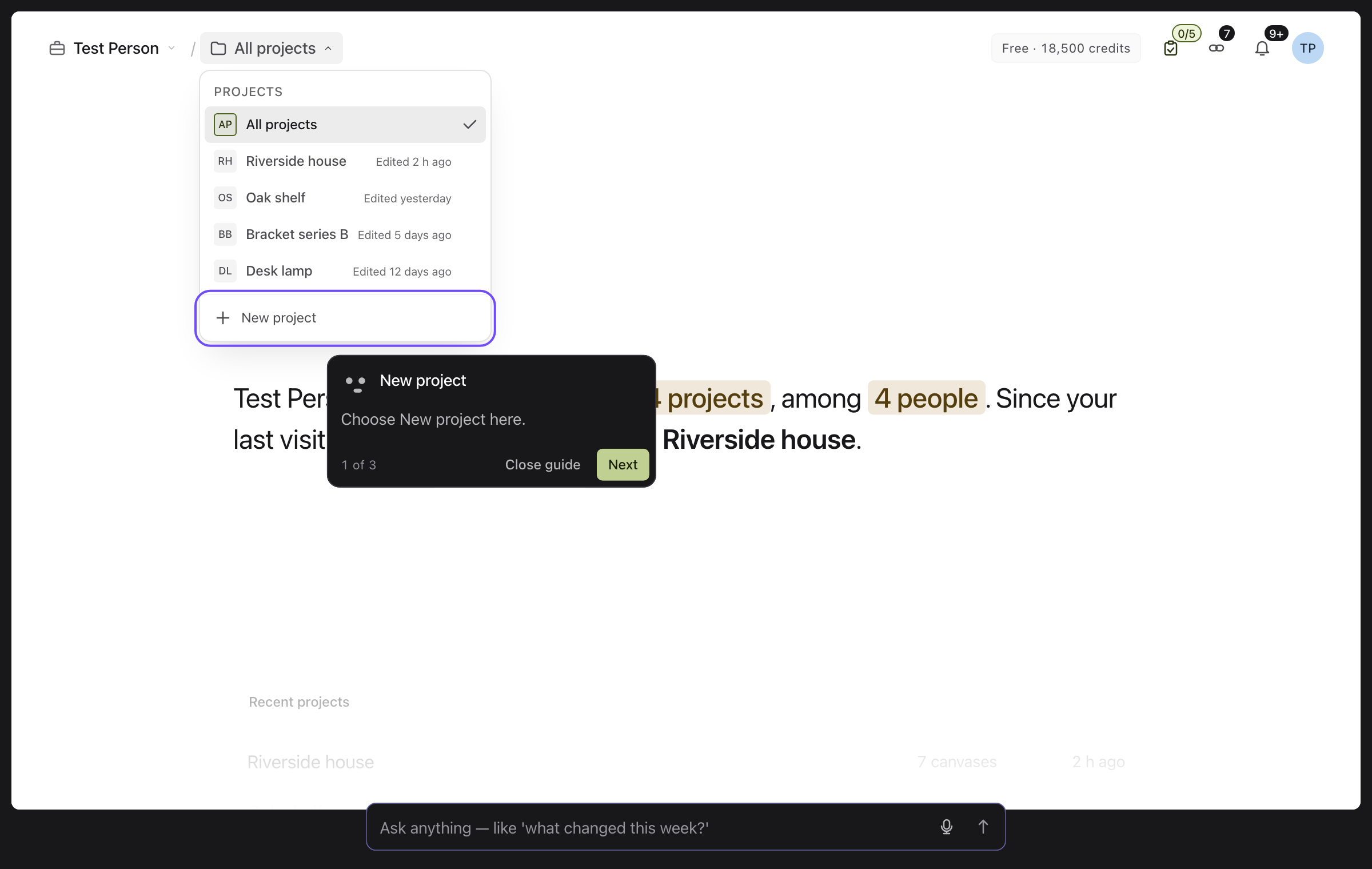
Mobbin’s analysis covered 1,460 onboarding flows and reported a mean of 25 screens across 986 apps. The number matters less to us than what happens before the first useful action. We want you to learn the bar by opening your own project or making a view you need. Explanations for the rest can arrive when you ask for them. Mobbin’s onboarding study
Mobbin also showed what changes when an AI design assistant can look up real shipped flows. Its demo drew on a library of over 600,000 screens. Seeing how a product gets someone through an entire task is a better reference for a guide than a still of the welcome screen. Mobbin on design research with its MCP
There’s a quieter kind of learning as well. Eskiz can notice repeated work on the device and use it to suggest a next step. The Learning settings let you see and control those signals and suggestions. That gives the app somewhere to put a useful habit without asking everyone the same ten questions on day one.
07 / 10
A place for the balance.
Workspace and project menus live in the header. Open the avatar menu to find your plan and available AI credits when the workspace has loaded its billing information. The separate header chip is contextual. It can appear before you’ve seen it, during its tour step, and while its billing panel is open. Once the chip has tucked away, hovering the header won’t bring it back. Open the avatar menu for the balance.
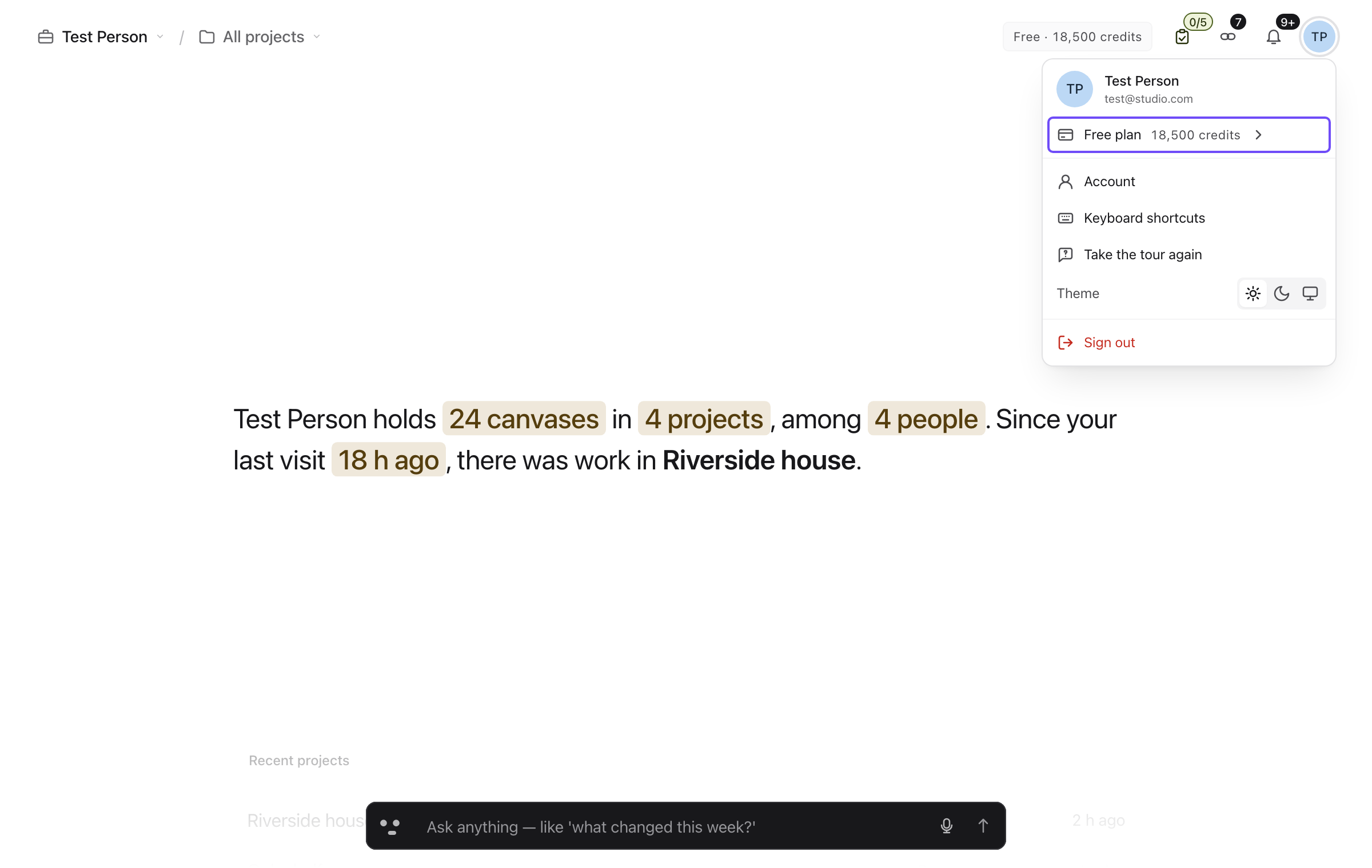
Credits let us include an allowance at a lower entry price and meter heavier AI use. Putting the balance where you can find it is part of that deal. The price of doing more work should be something you can check.
08 / 10
Something worth coming back for.
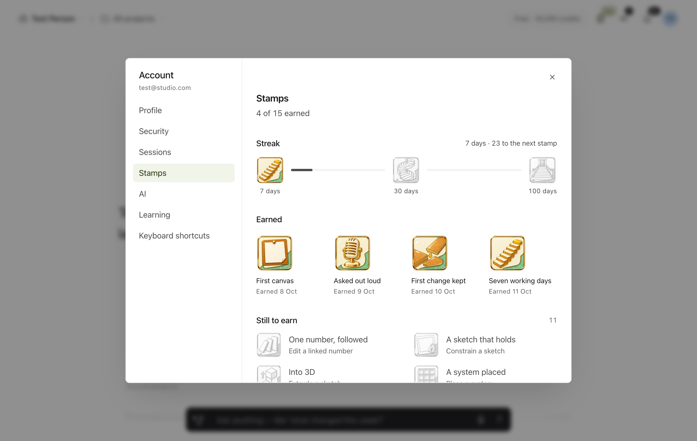
Mobbin’s review of 859 streak designs made us ask what we were rewarding. In Eskiz, working on and saving a canvas can count toward a working-day streak. The calendar distinguishes work, days off and grace days. There is room for Tuesday to happen. Mobbin’s streak study
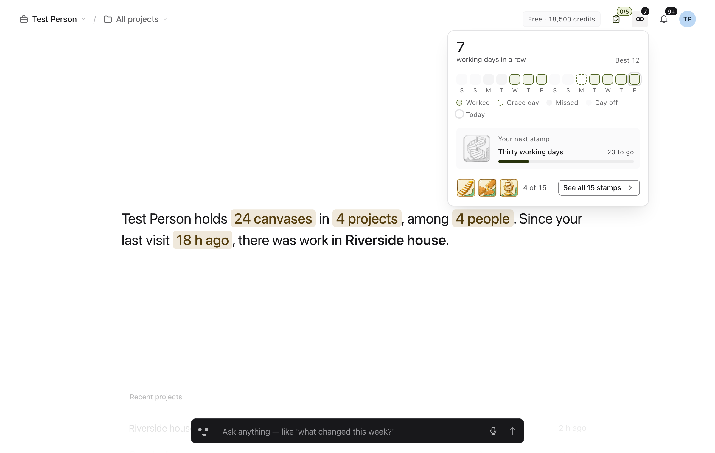
Open the chain in the header, then See all stamps. The collection includes firsts such as creating a canvas, asking out loud, and placing a system, alongside working-day milestones. Each stamp gives you an example of something you can do here. An earned stamp records something you actually tried.
09 / 10
“Back” is doing a lot of work.
We tried Luna and Haiku as general-purpose interpreters and tested OpenAI Realtime. A single model could handle a surprising range of requests, but the wait and the occasional wrong action were obvious on small turns. Nobody expects a conversation about a button press, particularly with the button.
Cactus Compute’s Needle was an appealing small-model experiment. It picked the expected action about 46% of the time in our initial run. Fine-tuning it for our commands is an experiment we still want to run. Cactus Compute’s Needle
We tried retrieval as a shortcut to the right tools. It was useful for finding candidates, but our setup could rank a command highly because the words looked right. “Go back” can mean the previous section, the previous page, or undo. “Open settings” can mean your profile or the workspace. A plausible search result can still be the wrong thing to execute.
We collected the misses, rewrote the prompt and tool descriptions, and ran the cases again. We replaced catch-all names such as “back” with actions that name what moves. The current catalogue describes section.focus as moving between dashboard sections, and distinguishes workspace settings from account settings. One internal routing run landed near 97%. In a separate 888-case run, action selection scored 97.8% on the 90 section cases and 91.0% across all action types. Picking the action and filling in the right project name are two different tests.
10 / 10
Show that you heard me.
Our current approach gives each part of a spoken turn a smaller job. We pass the transcript to Jev as soon as it’s ready. Jev picks the action. If it can run immediately, such as stepping to the next section, we run it. If the request needs details, we still show that we heard you and are working on it. Haiku extracts the values while the interface is already responding.
“Next section”
Transcript → Jev → Move the stage

“Create a project, Riverside annex”
Transcript → Jev → Show progress
          ↳ Haiku fills the name
          ↳ Open the form for review

Spoken reply → Eleven v4 stream
ElevenLabs Eleven v4 streams spoken replies, and fixed lines can be reused. The screen can move, acknowledge a request, or show a form before the audio finishes. When a form still needs your review, the acknowledgement says what is happening. It has no reason to declare that the project already exists.
The thing I want out of the dashboard is still the same. I open it, see what moved on Riverside house, and get back to the drawing. If I can ask for one extra thing along the way and keep going, the bar has earned its space.